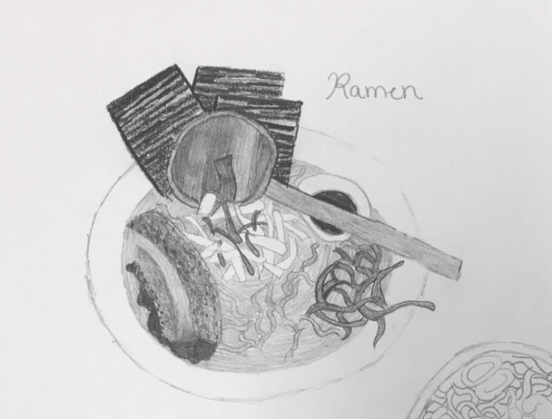
Clay Food Final
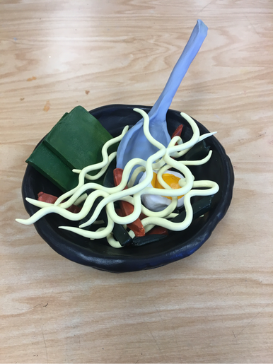
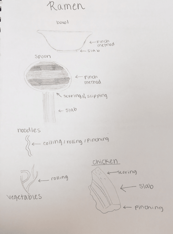
This is a picture of my clay food final, which is a bowl of Ramen Noodles. I first made the the bowl using the coiling method and painted it black. Then I made the spoon using The pinching method and slip and scored the handle, then painted it gray. Then I made noodles, I rolling each one individually and then pinching it to create bends, then painted it yellow. After that I made the vegetables I just cut out some rectangles and painted them orange and gray. When I was finished with that I cut it out my dried seaweed by cutting out squares, then I painted a green. Finally I made an egg by using the pinching method, and then I painted the inside yellow as the yolk.
Clay Food Sketches
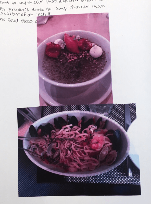
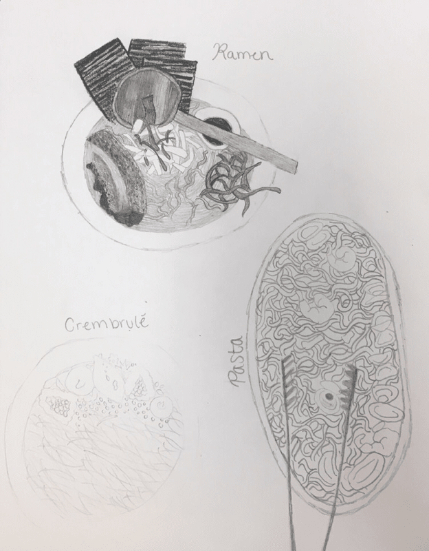
These three pictures are my sketches and regency photos. In this I used three different photos of Ramen, Crembrulé and Pasta. In the very left photo I decided how I was going to construct the different pieces of my final sketch. The middle picture is a photo of my references of my own photos. The very right photo are my three sketches for each of my ideas.
Clay Food Final Sketch
In this final sketch I used my own photo to create this drawing. This drawing is of ramen with vegetables, noodles and much more inside. I use shading to show the different values of the foods, and then I used the different shapes to differentiate the different foods in the bowl. I then drew the spoon that was included in the dish as the utensil.
Critique Questions
1. Describe the craftsmanship of your sculpture.
A: my craftsmanship and the scripture is very neat. When I was finished coiling my bowl, I spread the cleat evenly it to get a smooth texture. When I was creating the vegetables I used other techniques, like rolling and heading to create symmetric and smooth food.
2. What was the most difficult part of this project?
A: most difficult part of this project was creating the bowl. I restarted the ball three different times, only using two different techniques. The first two times I tried using the pinching method, it didn't work very well. Then Mare. Rossi suggested that I use the coiling method. Which that method worked the best. I had to roll out many cylinders of clay, and then spread the Clay even leave to get a bowl like shape. It took multiple days but it was very worth it.
3. Did your color choices work together to harmony?
A: I believe my coach with us to work together in harmony, because the light in the dark contrast each other in the right way. The light of the noodles with the light of the egg work together with the gray spoon. Which is all held together with a black bowl, aesthetic works perfectly together.
4. Your sculpture interesting from all views?
A: My sculpture is interesting from all views. It's because it's a circular sculpture, which is symmetrical from all sides. It also has many different types of food inside of the bowl. Which helps the sculpture be more interesting.
5. Describe the differences between constructing a sculpture and doing something in 2D?
A: doing something is 2D is A lot easier than doing something in 3-D. It's because you can't erase something and created again; but in 3-D the only way you can start over is if you destroy it.
6. How did you create textures in your sculpture?
A: I created texture by using a smooth and hard vegetables and services. List of the vegetables and services are smooth, but the egg is hard looking and bumpy. The small rectangular vegetables are also more rigid. They have harder edges and not smooth surfaces.
7. Does your sculpture look like the actual food? How did you accomplish this?
A: I believe my sculpture looks exactly like the food. I did this by creating the bowl and then focusing on the noodles. I also created the same shape for the bowl and the spoon.
8. What would you do differently if you had this project again?
A: if I had this project again I would create a different type of food. I would do a full animal like an aquatic one. Other than that I believe I did a pretty good job.
Print making 10 Ideas
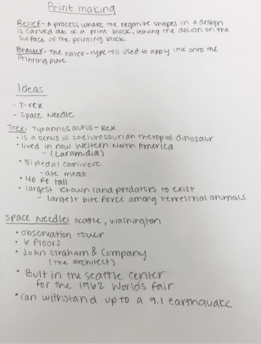
In this picture are my two ideas and facts about them. My original ten ideas were, the Space Needle, Eiffel Tower, Coral, T-Rex, Pterodactyl, the Great Coral Reef, Light house, Big Ben, Niagra Falls and the Golden Gate Bridge.
Print Making Sketches
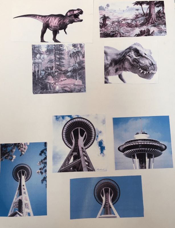
In this picture on the left I have my reference photos for my two main ideas for print making. My first idea was the Seattle Space Needle and my second was a dinosaur/t-rex. On the picture in the right I have 2 mini sketches of my two ideas, where I sketched the background, foreground and middle ground.
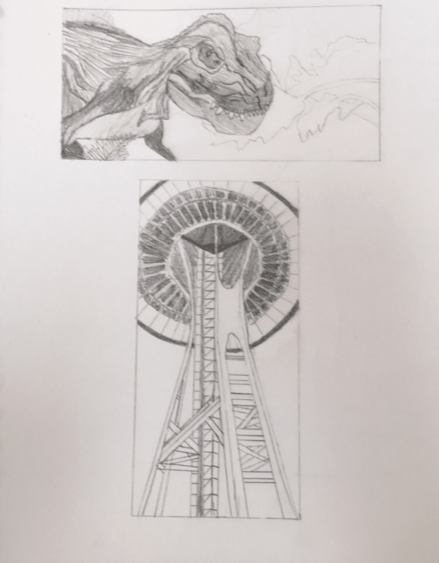
Print Making Final Sketch
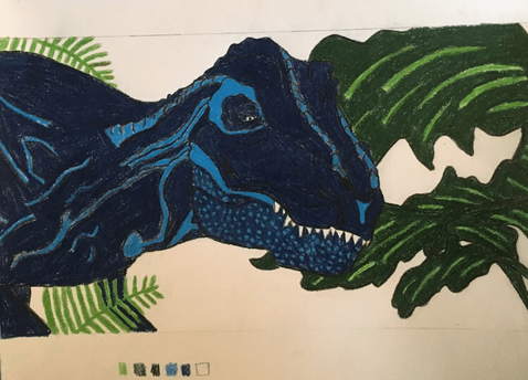
In this photo my final drawing is a T-Rex, with a color scheme of green, blue, white, organge and black. In this drawing I used two different veggiation using different shades and tints of green, and then using different types of plants to show more variation in the background. My middleground is the T-Rex, which has blue, black, white and black. It aslo has different shades and tints of blue to show variation and dimension. My foreground is the very front veggitation in front of the T-Rex. My background is also organge to be more vibrant and complement the other colors in the color scheme.
Print - Making Final
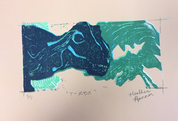
This is my print making final, which is of a dinosaur in the jungle. I use the colors pink, light green, dark green, light blue, dark blue and white. I used these colors to show value and texture in my print. I first sketched out using it two reference photos, and then transferred it onto linoleum. After that I carved then rolled to create the print. I made five original prints and then pick the best one to show my blog.
Critique Questions
1. Describe the craftsmanship of your prints.
A:
Burnishing and ink coverage: The craftsmanship was mostly neat but sometimes messy. Some of them I would get the print slightly off, but most they were mostly in line. Most of the colors would show through, but it wouldn't diminish the print.
registration an carving: my carving it was mostly in line, but sometimes I would carve outside of my lines. At one point I decided not to care about tiny dots because I knew it was impossible. I also had a hard time lining up my registration lines to my linoleum to get the sketch in line.
2. How did you use texture, Color harmony and balance to define your subject?
A:
Texture: are use texture by creating patches on the leaves to show color variation and shadows. Also use the light blue to show the dinosaurs bumps in their face.
Color Harmony: are use color harmony by using two blues and two greens that complemented each other. I used the tints on top of the shades to create a harmony. I also use a color scheme complemented each other.
Balance: my principal is visually pleasing and most of my prints were in the center of my paper. The color harmony had a very good aesthetic which complemented my picture.
3. You could re-create this print what would you do differently?
A: If I was able to recreated this print I would try to align the prints more evenly, and try to add more texture in the print.
A:
Burnishing and ink coverage: The craftsmanship was mostly neat but sometimes messy. Some of them I would get the print slightly off, but most they were mostly in line. Most of the colors would show through, but it wouldn't diminish the print.
registration an carving: my carving it was mostly in line, but sometimes I would carve outside of my lines. At one point I decided not to care about tiny dots because I knew it was impossible. I also had a hard time lining up my registration lines to my linoleum to get the sketch in line.
2. How did you use texture, Color harmony and balance to define your subject?
A:
Texture: are use texture by creating patches on the leaves to show color variation and shadows. Also use the light blue to show the dinosaurs bumps in their face.
Color Harmony: are use color harmony by using two blues and two greens that complemented each other. I used the tints on top of the shades to create a harmony. I also use a color scheme complemented each other.
Balance: my principal is visually pleasing and most of my prints were in the center of my paper. The color harmony had a very good aesthetic which complemented my picture.
3. You could re-create this print what would you do differently?
A: If I was able to recreated this print I would try to align the prints more evenly, and try to add more texture in the print.
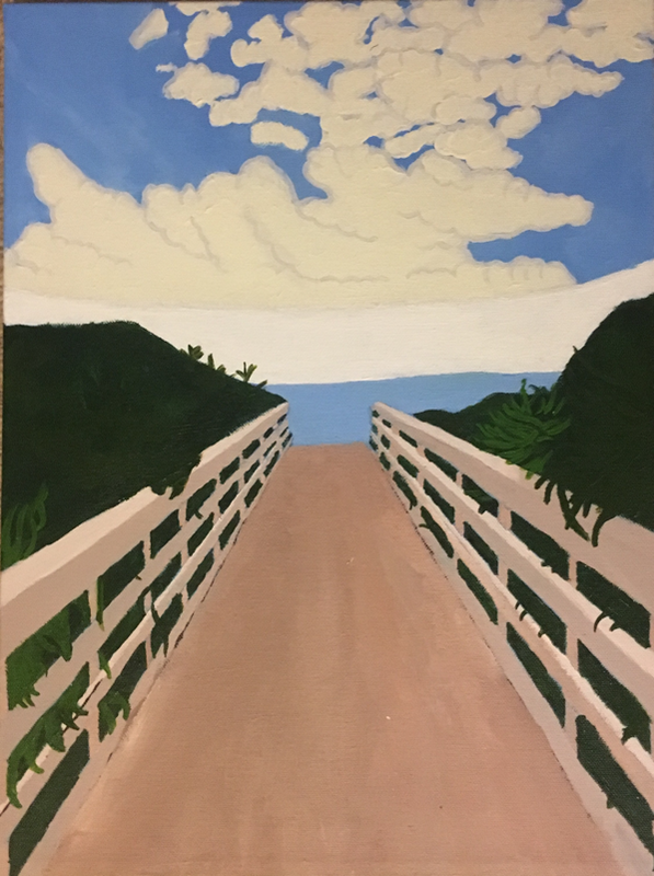
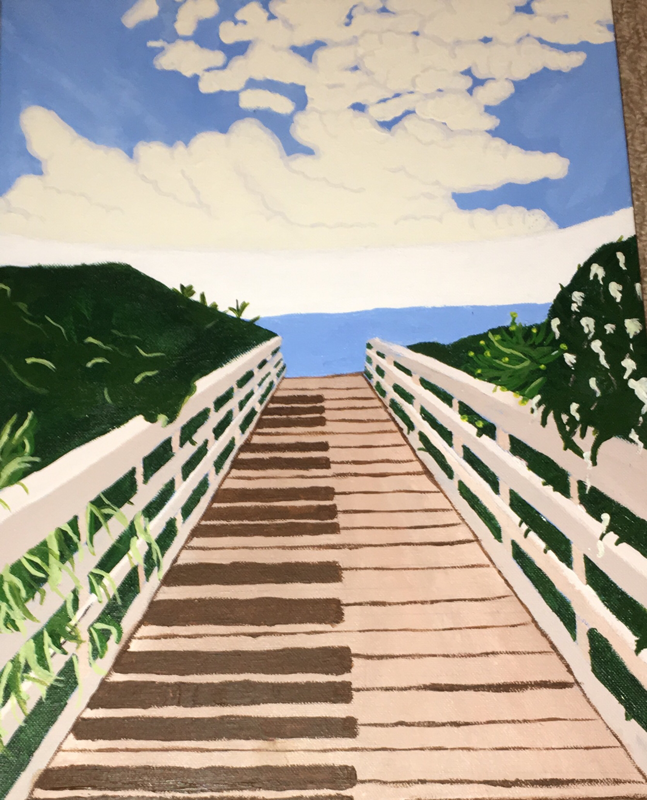
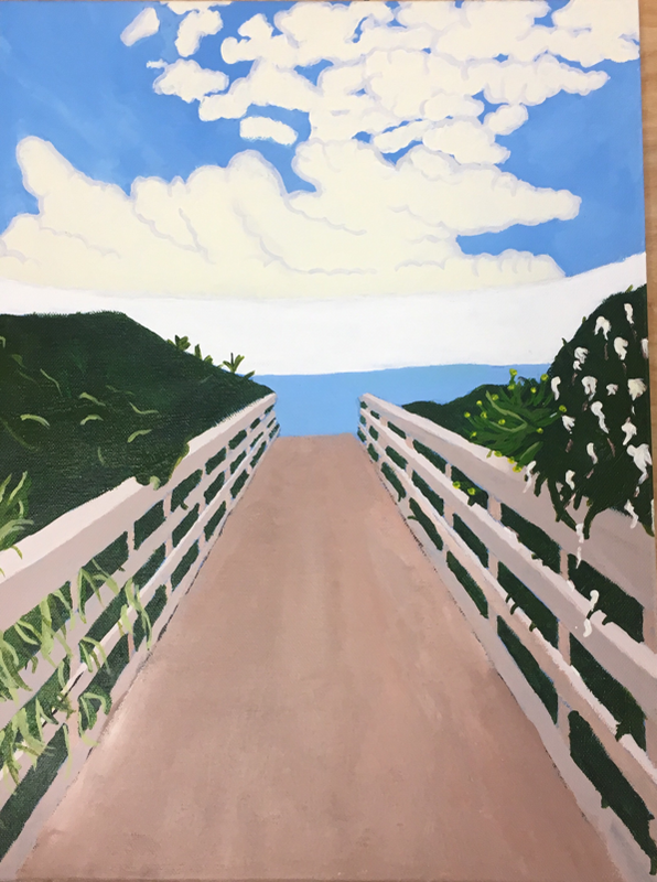
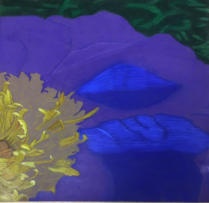
Landscape Inspired Painting
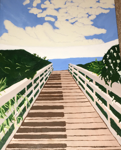
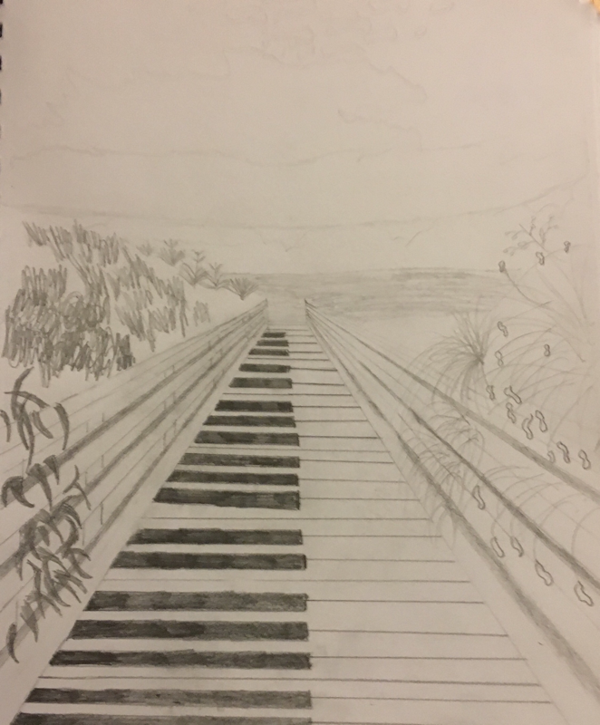
In this painting I had Salvador Dali as my artist, so I used the surrealism from his paintings to inspire mine. I used a picture from the beach that I took over the summer. From this picture I changed only the top clouds to a light green color to mimic the earth. Then I created the board walk into piano keys, to alloud the allousion of calmness classical music brings to people; after that I created melting flowers to create the allusion of melting beauty, because of the climate this picture was located in. I also used many different greens, browns, whites and blues. For the blues I created the sky using three different tints to create depth in the sky. Then I used a solid blue for the ocean. I then used three tints and one shade of green. I used the shade to create the 'background' of the bushes; after that is used the other three tints to show the individual bushes and leaves. I used the white for the clouds and the flowers. I then added tiny pink sparkly paint to give it a little more spunk. For the clouds I then went in with grey to give it depth.
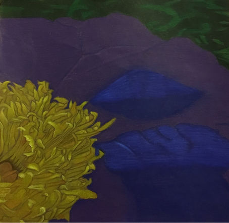
Inprogress Pictures
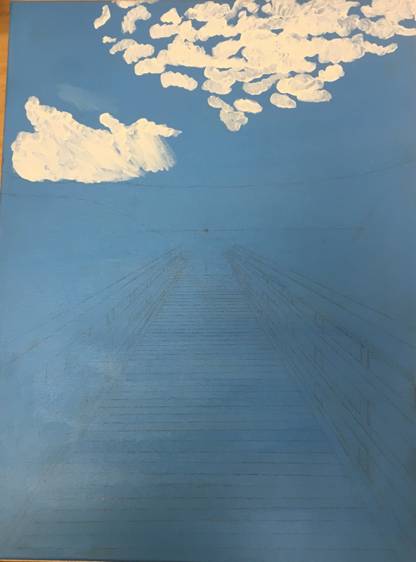
These are some pictures I took through the process of painting my painting. First I covered my canvas in a base paint, so the colors wpild
show more vibrant. Then I painted the whole canvas blue for the sky, after that I sketched on the rest of the picture. Next I painted the clouds, then the bushes, then the ocean and then the board walk. After all of that I then added details to the painting to make it look more realistic and make it more surrealistic.
show more vibrant. Then I painted the whole canvas blue for the sky, after that I sketched on the rest of the picture. Next I painted the clouds, then the bushes, then the ocean and then the board walk. After all of that I then added details to the painting to make it look more realistic and make it more surrealistic.
Salvador Dali
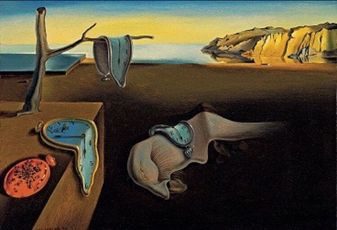
Salvador Dali was a surrealist painter in the 1900s, he was born in Spain and created art throught his life. He went to an art school but eventually got kicked out, but then soon joined a surrealist group and started painting his most known paintings. In the picture above is the "Persicantce of Time" which is his most famous piece of art. In this painting he is allouding to time being flouid instead of stiff and calculated. He mostly painted in surreaslism but sometimes went into other styles; surrealism is the expression of the unconscious, so he would create images that could be seen and meant as something else.
Landscape Inspired Sketches
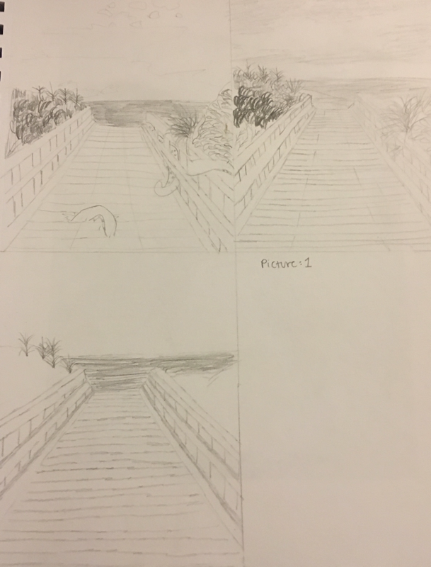
These are my three mini sketches for this photo and my final sketch. In the three mini sketches I drew three different levels of detail for the picture, adding more detail in others. Then in my final sketch I incorporated all of my surrealist ideas; like the piano keys, themelting flowers and the earth as the sky.
Questions and Answers
1. Who was your reference artist for the painting? Name 4 main ideas you used from your reasearch to create your painting?
Name- Salvador Dali
1. To create from your unconscious
2. Neat brush strokes
3. Create a meaning with the painting
4. Make the painting look realistic but still wimpsical
2. Describe the craftmanship of your painting?
The craftmanship is pretty well, but could be better. I did very well on part of the board walk, but I could have made the Lines on the keys a bit neater. I feel like I also did well creating value on the sky, but the clouds could have more shading. The melting flowers looked pretty good, especially with the pink sparkles. Overall I believe I did pretty well.
3. What was the most difficult part of this project?
The hardest part of this project was the piano keys, and trying to get the lines neat and to look realistic. This was especially hard because I used a paintbrush; which I am not very skilled with, so it was harder for me to complete this part with satisfaction.
4. Describe your color choices and how they reflect the work of your chosen artist.
The colors represented my chosen artist by showing the realistic side of the style. Dali would use colors that were in the landscape in real life. This colors I used were also the colors that were in the landscape. The colors were blue, green, brown and white. I chose to represent the true colors because the surrealist part of my painting was in the shapes instead of the colors.
5. Describe how the style of your landscape reflects your chosen artist.
My landscape reflects the style of my artist because of the simplicity of the painting. The simplicity lets the landscape come to life when the surrealism is added. Dali liked simple landscapes with a lot of surrealism added on, so he could show his unconscious with the semi blank background.
6. What do you think your chosen artist would say if he saw your painting today?
I believe he would say something about how mine is worse than his and how I could do better. I believe this because in art school he told his professors he was a better painter than them, and was very confident in his talents.
7. What would you do differently if you could do the project over again?
I would make the lines cleaner and add more value to the sky and the bushes. I would use a ruler to create the neater lines. I would also put more shades into the clouds. Then I would create the bushes with more visible values.
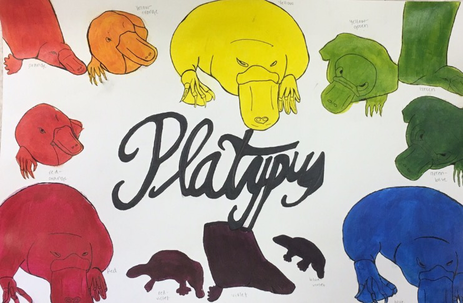
Color Wheel
This is my color wheel, the colors are represented by platypuses in primary, secondary and tertiary colors. I did this by finding five photos on the internet; then arranging them in the order I wanted them. Next I painted them and outlines them.
Paint Value
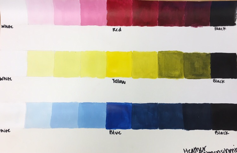
This is my paint value chart. I used red, blue and yellow to represent color values. I added white to get the tints, and black to get the shades.
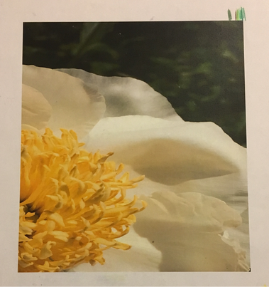
O'keeffe Insipred Sketches
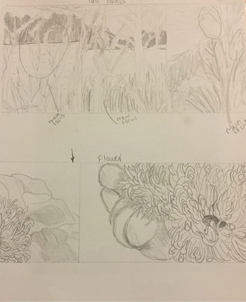
These sketches are O'keef inspired because it is upclose pictures of nature. That's Sketches are of tall grass and of flowers. The top three sketches are of a piece of straw grass, with tress and water in the background. The bottom three sketches are of a white flower, zoomed in on the top right. The sketches are of the petals and the the Stamen, with green bushes of the background.
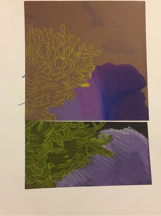
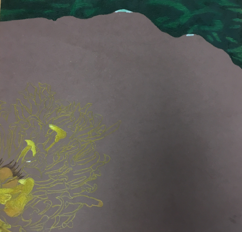
This is my final sketch on two different colored papers. I used black and brown to find the best fit for this project and the colors I used. In this sketch I created two different color petals to decide which one I would use. I also sketched out the Stamens on each, so I could practice the technique for my final. In this sketch I used prisma colors so I could blend the yellows or violets together.
O'keeffe inspired final: progress photos
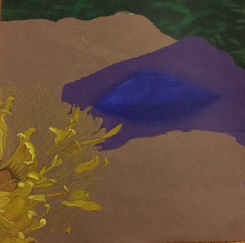
These are photos of my artwork inspired by O'Keefe. I used Prisma color Pencils to create the color of this piece. I used a reference photo to create the fine detail in the piece, and these photos were taken over a week process.
O'keeffe inspired final
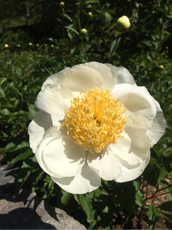
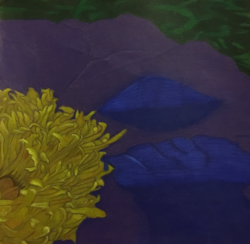
In this final I used a picture that I took at the Duke gardens, which I zoomed in on the top right. I did this because I was influenced by O'keeffe so I zoomed so the viewer couldn't immediately tell what they were looking at. Are use prisma colors to create the saturation and the blended colors. I then used violets to create the shading and purple as the petals, and I used greens to show the variations of the bushes in the background. I also used variations of yellow to show the stamens and the sheeting and highlights in the photo.
Critique Questions
1. Describe the craftsmanship of your drawing.
My craftsmanship in the drawing it's very neat, because I used darker shades on the Stamen to show the individual Stamen; this also showed the variation of the shading and highlights because of the craftsmanship.
2. Do you think that you used a full range of values to create the illusion of depth?
I don't feel like I used a full range of values to create depth, but I believe I used a good amount of values to create depth.
3. How do you think you represented the style of the artist Georgia Okeefe?
I believe I represented Georgia pretty well, I used her techniques like zooming in on nature and using colors that aren't there. I used two variations of violet to show the shading of the petals, but the original color is white and the shading is grey. I also think I could have zoomed in more to one side to create more of the style of Georgia O'keeffe.
4. Describe your choice of color/color harmonies and how you used them to throw your artwork.
My choice of color was mostly based on the actual flower, but I did add purple and violet as the color of the petals instead of white. I did this so it wouldn't be a piece of artwork with mostly white. I used purple and violet together because they were the best color combination that went with the variations of yellow and green. I used the more organge shades in the Stamen to create the shading, and used the violets in the petal in the same way. I used a combination of white and yellow to create the highlights on the Stamen, and a bit of white with violets to create a lighter shading in the petals.
5. How did you create contrast in your drawing?
I used contrast by using different shades in different colors. Example would be on the petals are use violence to show the contrast, and use the white to show the highlight on the Stamen. I also used brown in the statement to show the individual ones.
6. Did you use textures, highlights and shadows to enhance your work?
I used the combination of the different greens to show the variation of the leaves in the background. I used the light yellows to show where the sun was shining on the flower, and created a highlight. I used shadows to show the third demention of the flower, so my artwork would look as realistic as possible.
7. Describe any difficulties you had creating your drawing and what could you do to improve it?
I had difficulty blending the violet towards the end, because it became too saturated and couldn't create the same color. This caused the blue violet to become purple, so I erased it and redid the shading. I also had a problem trying to recreate the shading 100% true to the reference photo. I would go lighter on the shading and created it in layers, if I could go back. I would also improve it by only using one brown throughout the duration of creating the project; instead of using a warmer brown in the begining to show shading.
Water Color Apples
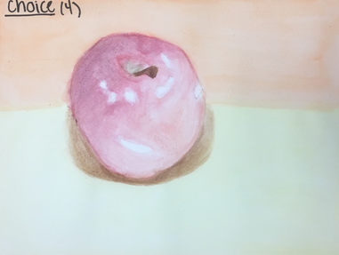
In this I painted my Apple with pink, organge, brown, green and white. I created value with layering my colors, and creating highlights with using white spots. I then created a shadow using a brown, and layering it to creat demention. I created a background with a yellow base and an orange top. This was my choice Apple (4).
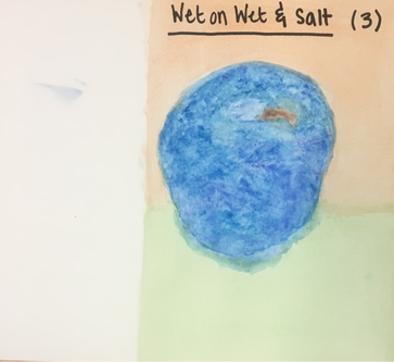
In this apple I used wet on wet and salt techniques to create value in my apple. I used two tones of blue, brown and white. I then used wet on wet to create value on my apple, and salt to create texture. For my shadow I used the darker blue to create a shadow. My background I used green as the base and orange as my top. This was my wet on wet/slat apple (3).
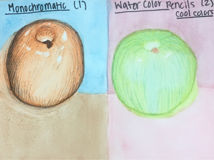
In my first Apple I did the monochromatic technique, and then layered it with pen to create more value in the Apple. for the color I used orange, and layered it to create value in the Apple. I then used the pen to create a harsher value change to show more of the multiple shades of orange. I created the shadow using the orange again. I then created a background using brown as my base, and blue as my top. This was my monochromatic apple (1), using pen and ink techniques.
In my second apple I did water color pencil technique to create value in my apple. I used cool tones of blue, green and brown. I then added white to show the highlights of the apple. I then added color pencil on top of my apple to show the multiple values in the apple, and the multiple colors located throughout the apple. The multiple values of the apple doesn't correlate with the light, therefore there is more value in the apple with light source. I then used dry paint to create the outline of the apple; I then created a shadow using the darker value of the cool green. I then created a background using two tones of red. The cooler tone as my base and the warmer tone as my top. This was my color pencil apple (2), using color pencil.
In my second apple I did water color pencil technique to create value in my apple. I used cool tones of blue, green and brown. I then added white to show the highlights of the apple. I then added color pencil on top of my apple to show the multiple values in the apple, and the multiple colors located throughout the apple. The multiple values of the apple doesn't correlate with the light, therefore there is more value in the apple with light source. I then used dry paint to create the outline of the apple; I then created a shadow using the darker value of the cool green. I then created a background using two tones of red. The cooler tone as my base and the warmer tone as my top. This was my color pencil apple (2), using color pencil.
Color Pencil Spheres
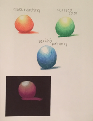
In this photo I am practicing my color pencil techniques on colored and non colored paper. In the top left I did cross hatching using orange, yellow, red and white to show shading and highlight. In the top right I did layered color, where I blended the colors together to make the sphere more realistic. I used green, yellow and white to show highlight and value. The middle sphere I did behind painting technique; where I started with the darkest shade, and the blended the lighter shades after. I then used blue, green and white to show value and highlights. In the bottom I did a sphere on a black piece of paper, where I used the layered color technique to show value; using beige, pink and white
Color pencil practice: Pear
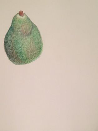
In this sketch I used color pencil to draw a pear. I used many colors to show value and highlights. I also used colors a person wouldn't normally find on this fruit. I used blue, brown, green, pink and white in this pear. I did this to prepare for using color pencils on colored paper.
Pear: final
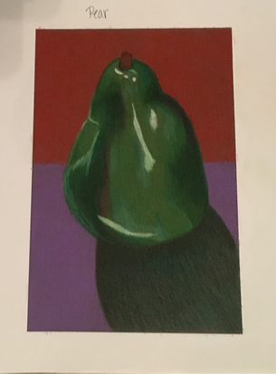
In this drawing I used green, pink, brown, and white to show value on the pear. The lighting casted a shadow, which also created highlights too. I then created a orange and purple background, to show the pear isn't floating in the air. In this pear I used the layered color technique throughout the pear.
Pumpkin: final
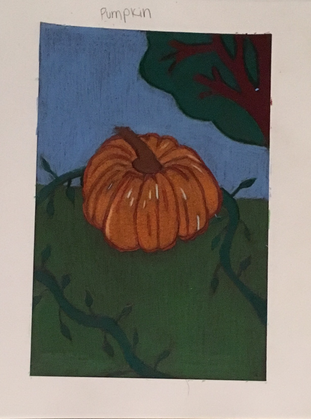
In this drawing I drew a pumpkin using the layered colored technique. I drew the pumpkin using organge, red, brown and white to show value and highlights. The light is casting a shadow behind the pumpkin. I created a scene that shows the pumpkin in a pumpkin patch with a tree in the background.
Pear and Pumpkin: final
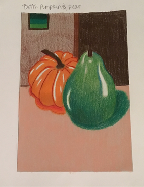
In this drawing I drew the pear and the pumpkin together. I used layered color technique to show value and highlights in the pumpkin and pear. I used red, orange, brown and white for the orange. Then I used green, blue, brown and white to create value and highlights in the pear. The light is casting a shadow to the bottom left of the fruits. I also created a background, I put the fruits on a table in a room. The room has a door and a picture on the wall.
Critique Questions
1. Discuss your decision to on pen and ink techniques. Why you chose to do one or more.
I decided to use only one pen and ink technique because I was only good at one. The one I was good at was stippling; it was the one I could manipulate the best, and create the best drawing possible. I also only did one because I didn't like the way they looked together in my final sketch.
2. How did you use perspective? Why is perspective important?
I used perspective through the sharks mouth. I placed four fish about to enter the perspective, located outside of the mouth. Perspective is important because it shows the depth and orientation of the objects located in the space.
3. How is texture important in your composition?
Texture is important in my composition by showing the different elements in my drawing. The shark, fish and the water is all shown through texture. My texture was used to show the smooth texture of the shark, and the scales on the fish.
4. Why is value important in this project?
Value is important because it shows the shading of everything in this project. It shows the darkness of the shark, and the lightness of the splashing water. Value also makes a 2D project look 3D.
5. Describe your craftsmanship.
My craftsmenahip is very good on this project. The shark is the best part of this project, and the fish are the worst. I also had a couple of tails on some of my stippling.
6. If you could recreate this piece what would you do differently
If I could recreate this piece I would redo the fish, and make the water better. Some of the fish have some tails on the stippling, and the water doesn't look appealing to me.
7. When applying the pen and ink techniques why and how is it important to make sure you understand the concepts of taught in class?
Its important to understand the pen and ink techniques, so a person could make the project realistic as possible. Also so a person can use the techniques to their advantage.
8. As growing up as an artist how do you think what you have learned will guide you better your future projects?
This has taught me how to use value better, and use pen and ink. This will better my projects by making it more realistic and have more value. It will also expand the tools I use in my art.
Perspective Pen and Ink Final
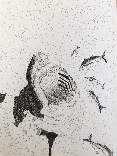
In my final I used only stippling to show the values in my drawing. I also added more fish going into the perspective, or the skarks mouth.
Pen and Ink Value Chart
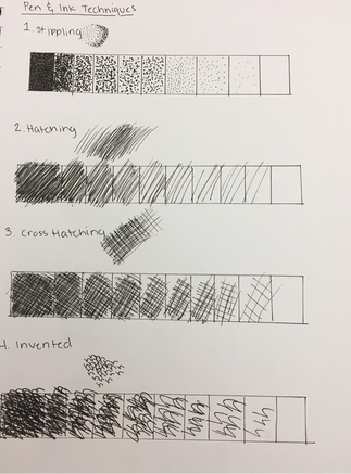
We did four value charts with four different pen and ink techniques. First we did Stippling, Hatching, Cross Hatching, and then invented. In my invented I did the letter "h", and showed value through them.
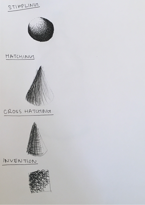
In this sketch I used the four techniques to show value in a 3D shape. I used hatching and cross hatching for the cone. I then used stippling for a sphere. For my third shape I did and square and used an invented technique. My invented technique was using the letter "h" and showing value.
Pen and Ink Bottle
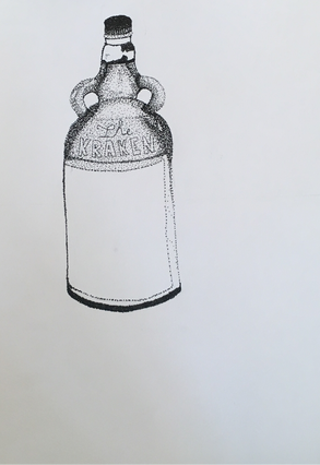
In this sketch I drew a bottle using pen and ink techniques. My pen and ink technique was stippling. I showed the value of this bottle by stippling closer together or farther apart.
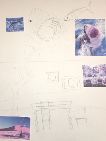
Perspective sketches
in these sketches I used the perspective idea and the fairy tell idea. For my perspective sketch I did a shark coming out of water, with fish going into its mouth. The sharks mouth would be the perspective. On my second sketch I did the fairy tell idea with Alice and wonderland. In this sketch I used the tea party scene, but I changed it but adding it into the desert instead of a lush forest in the book. I then added my reference photos on to my sketch to help myself draw it bettter.
Final Pen and Ink Sketch
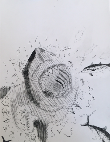
This is my final drawing, which I used stippling, hatching, and cross hatching. I used stippling to show the value of the fish, the water, and part of the inside of the sharks mouth. I used cross hatchingbtl show the value of the edges of the shark. Finally I used hatching to show the value of the shark.
One Point Perspective
In this drawing I did one point perspective on a street scene. I drew a couple of buildings and drew some Windows and doors. I also added sidewalks, and added a fence to my drawing.
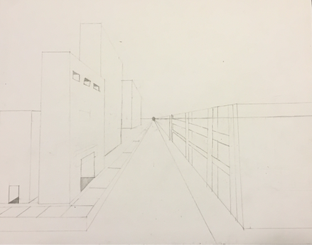
Two Point Perspective
in this drawing I did another street scene but in two point. I added a road and sidewalks, and created a few more buildings than last time. I also created more detail with windows, doors, and a brick building.
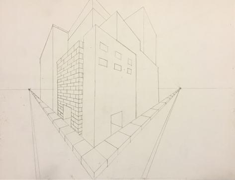
In this drawing I am using two point perspective, I am also drawing the corner of the art room. In this drawing I have created detail with drawing the cabinets, bricks, and tables.
Repeating Drawing Sketches
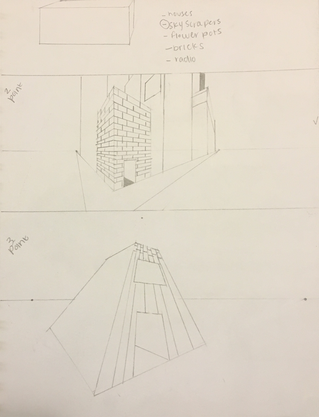
In this Sketch I am planing my final drawing, using the 3D rectangle as my object to draw. I first picked out five different objects to draw my shape; then I took that and chose skyscrapers. I then took that idea and picked two different perspectives and drew two different sketches.
My final drawing Idea
My idea was to draw Skyscrapers/tall buildings. I was inspired by the New York skyline, and how the bulidings are arranged. I took the most iconic building in the New York skyline, and put a spin on it. I drew it in three point perspective and shaded each rectangle like it's its own; with the Empire State Building as the focal point and other buildings beside it.
We had to take our object and put it into a real thing in reality, so I took the rectangle and made Skyscrapers. I then had to have the rectangle repeating, so I took each rectangle and shaded it like they are their own block. I then took 15 rectangular boxes and shaped them to look like buildings.
Min the final drawing the Empire State Building is made up of multiple rectangles, while the smaller buildings are composed of one rectangle each.
Final Drawing
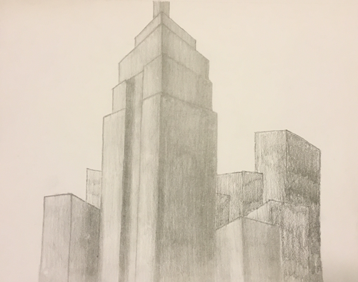
This is my final drawing of skyscrapers. It is inspired by the Empire State Building, and it's shaded as each rectangle is its own. The light is also shinning front the top left corner of the drawing. This drawing is also using two point perspective.
Value Shapes
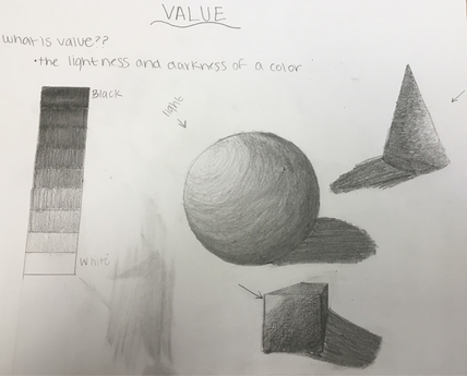
In this drawing I drew three different shapes, while adding value by shading. I shadded by using a point where light is shining onto the shapes, from a certain side.
