Reference Photo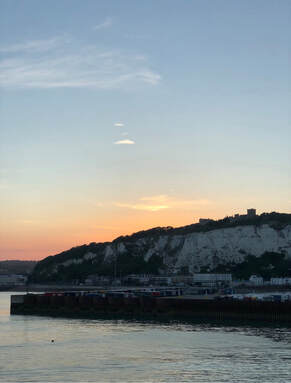 Final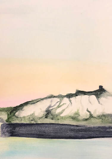 This is my twelfth and final concentration, of Dover, England. My family ditched my disabled grandma and took a day trip to get to France. We took a ferry from Dover, where its white cliffs are famous. On the boat back this was the money shot with the cliffs at dusk. It was unbelievably beautiful and extremely steep to climb back up. Yes our car was at the top. I did this at the very last second, so I knew I had to make it quick. I kept on messing up and started over three times. I mixed green with black to get the vegetation on the cliffs. Then added the black as the rocks. I used the blue in the sky and the water and added a little of green to show a reflection. The way I didn't mess up the sky was by using a big brush to blend all of the colors. Sorry I didn't take in progress pictures, but this actually took me 10 minutes. I wouldn't redo anything if I had the chance.
0 Comments
Reference Photo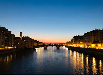 In ProgressFinal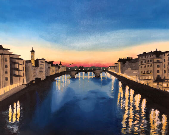 This is my eleventh concentration, the view from ponte vecchio in Florence, Italy. It was our last day traveling back up to Milan and we had a day to spend in Florence. We decided to see this famous bridge at dusk. This is the cityscape I saw from it. I blended the blue, yellow, orange, and red together to get the sunset, then I added white to show the clouds. I had a hard time figuring out how to do the water. I kept on blending the navy blue with white with a big paint brush - I got it eventually. I then added small strokes of white and yellow to show the lights reflection on the water. I then worked on the buildings. i tried my best and they turned out how something would after two days. They aren't the best and I would redo them if I could go back and fix something.
Reference Photo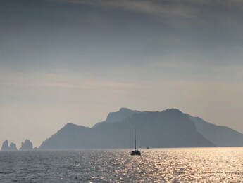 In ProgressFinal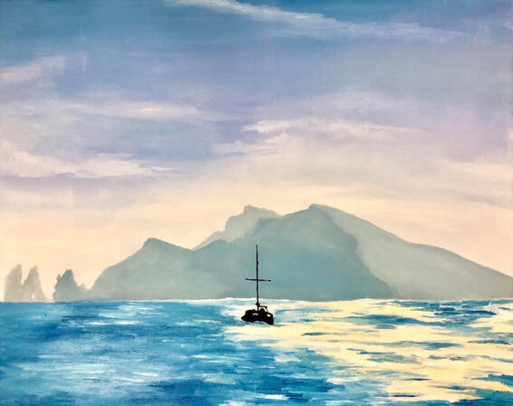 This is my tenth concentration, a picture of Capri, Italy. My family and I took a trip to Italy over spring break. One day we decided to take a day trip to explore the Amalfi Coast. We went to Amalfi by a bus on the way there and a ferry on the way back to Sorrento. This was a picture I took of Capri while on the ferry. This is a silhouette of the island with glittering water surrounding it. I blended two blues to create the sky and added white for the highlights. I used the navy blue hue to create the tint I used for the island. The black boat was a final touch I added. I had a hard time with the water; I had no idea how to do it. Eventually I painted a combination of short and long strokes of blues and white to get the water effect. If I could do t his all over I would change the water because if I had more time I could have made it better.
Reference Photo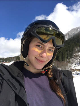 In ProgressFinal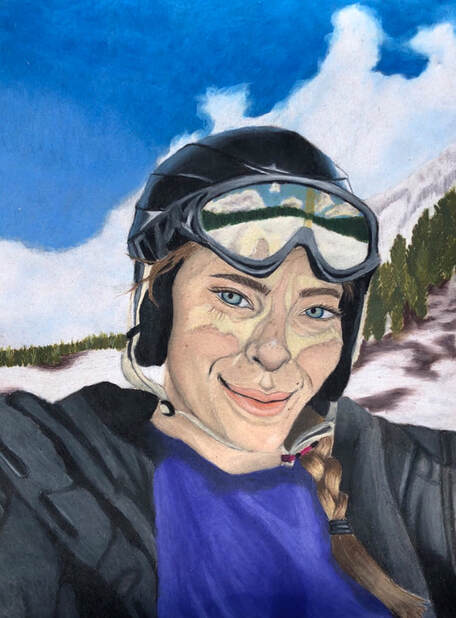 This is my ninth concentration, a selfie I took while skiing in Chamonix, France. This was Easter weekend, which is the last weekend to ski. My mom and dad decided we had to take the opportunity to ski in the Alps. I was stunned that it would be my first time skiing, so I got nervous because the Alps are intense mountains and I had zero idea how to navigate them. It was all good because we got a ski instructor. While learning how to walk up a mountain I got very discouraged because I was unable to get it down. I then became so frustrated I became very frustrated and started to cry - I hope you enjoyed that story-time. I left the instructor and learned how to ski by trial and error, and eventually got off of the bunny hill; the next hill up was a solid 40 degree angle - very scary.
I started this piece hand sketching it in the middle of second period. I actually did 90% of this piece in other classes while instruction was going on - whoops. After I free-hand sketched it perfectly in 20 minutes--to show someone that I don't need to trace to draw a person perfectly--I started on the sky. I used two blues and blended them into the clouds to get a more realistic look. Then I started on the helmet and goggles. While avoiding most of the face I did my jacket and sweater. I mostly avoided the face because I kept on forgetting face prismas at home. I added pink and browns to my face to show depth and rosiness. The yellow on my face is the reflection of my goggles. If I could go back and do something over I actually wouldn't change anything. rEFERENCE Photo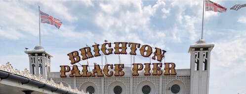 In ProgressfINAL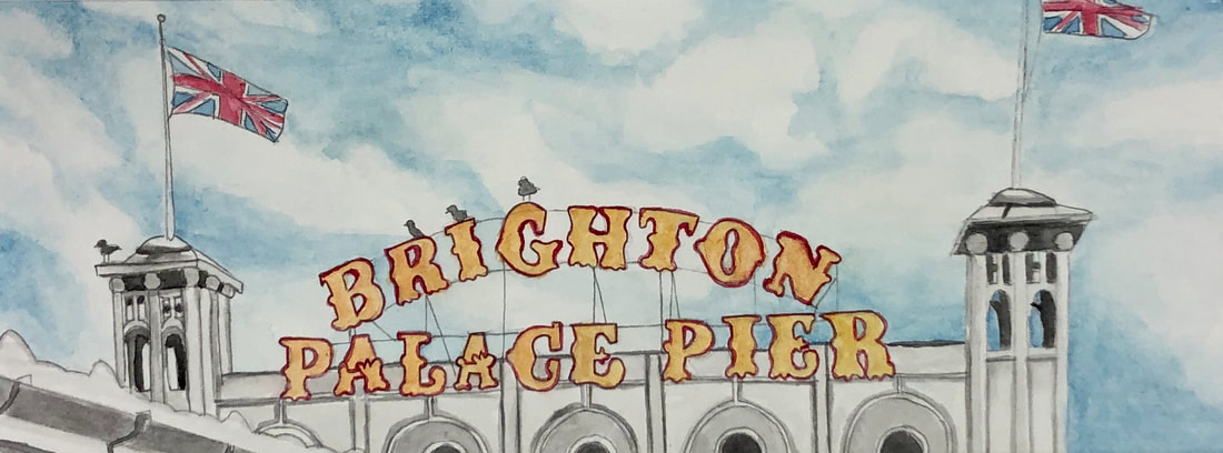 This is my eighth concentration, a "cityscape" of Brighton Palace Pier, England. Last summer my family and my grandma went t6 England. We decided to take a day trip to Brighton to shop and check out the pebble beach. This pier has an arcade on it and is extremely busy during the summer. There were venders along it and, of course, shows british pride with the Union Jack on either side.
I started by tracing it out because I am horrible at drawing straight lines and I did not want to mess up the letters in the sign - you have to know your strengths. After I got the hard lines, I went and filled in with more details. The sky was the first thing I did. I put the hue in some places and blended out the tint into clouds, where they were just the white paper. Then I started working on the sign; filling in the letters with a yellow and outlining them with the red. I messed up quite a bit with the outline, but that is okay. I then worked on the building with adding harsh black to create shadows in the distance, darker lines to show different columns, and shading to create more depth. The flags were a little tricky because they are blowing in the wind and don't have exact proportions. My main concern with this piece was creating sharp and straight lines - if I accomplished that is a different story. I hope I did. If I could fix one thing I would fix the the inconsistency of red outlines on the sign - it just bothers me. Reference Photo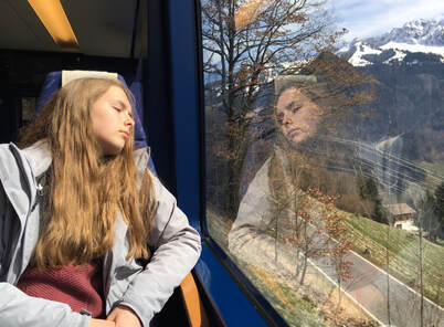 In ProgressfINAL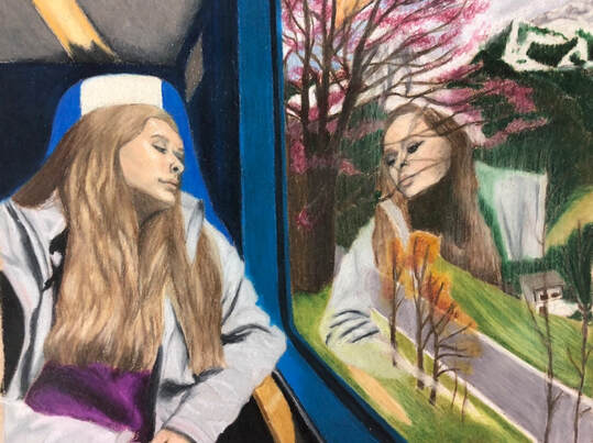 This is my seventh concentration, my sister on a train in Clarens, Switzerland. My family and I took a day to explore Switzerland by train and adventure out through the Alps. By doing this we ended up in Bern, Switzerland - the German speaking part. To do this it required an early wake up call, so we slept through some of it; my mom was so mad at us because we were missing the amazing views on the way there
When I started this piece I decided to trace part of it so I could get my sister to look as much as herself as possible. When I started putting prisma to paper, I saturated the architecture of the train while providing the shadow in the background. Then I progressed to work on Jen's hair; I mixed two browns with a light yellow and a beige. I went in with a white and a dark brown to add the highlights and shadows to create depth. Jen's face was easy, but it was difficult to get her facial features to look correct. The eyelids and lips was the most challenging part. I feel kinda bad because her lips look like they have injections, but that's exactly the shape they were in the picture - oh well. The left side was the easiest part. I initially had no idea how I was going to cohesively do a reflection in the window. The background was easy, but the other Jen was horrible. She doesn't look like Jen at all. I gave up after I realized that and started working on blending the background in with the reflection. At the last minute I added the white streaks, I don't know if I like it. If I could go back and do it all over I would redo the whole right side of the piece and make it look more realistic. |
AuthorEach piece I post here will be added to my AP Art Portfolio. This is the second half of my yearlong journey in Art 4/AP Art. I will be extremely stressed, do to the pressed time . I hope everything goes well and I will actually have 24 pieces to submit to College Board Archives
May 2019
Categories |
 RSS Feed
